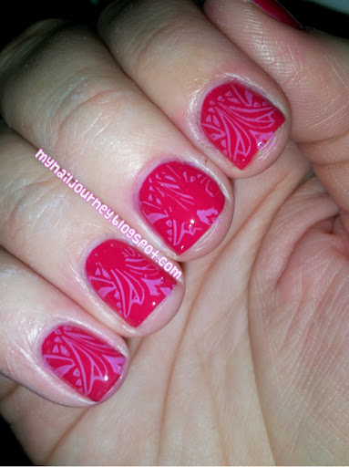
This was so hard for me to do because I do not like clashing colors! I decided to go with red and purple. I wish that the stamping had turned out better, but it didn't. I really wanted to redo this one, but I left it alone. Blah. Can you tell how un-enthusiastic I am about this one?

Base coat: Pro FX Fiberized Ridge Filler
Base color: Red Red from Wet N' Wild - 1 coat
Stamping color: Lavenbaby
Stamping image: Mash 41
Top coat: Seche Vite
What colors do you hate seeing together?
This one was hard for me too because I also don't like clashing colors!!! I think all opposites just don't look right together... That's why they're called opposites!! This one is very subtle though nd I really like it!!
ReplyDeleteThank you! It was so subtle you couldn't even see it without the flash! lol.
Delete